

In web design, how elements are arranged can completely change how users understand and interact with your content. One important design principle that helps create clarity and better user experiences is proximity. It’s a simple yet powerful tool that can shape the way users view, interpret, and respond to the elements on your website.
So, what is proximity in web design, and how does it work? Let’s explore this key concept and how you can apply it to improve your website’s usability and appearance.
What Is Proximity in Web Design?
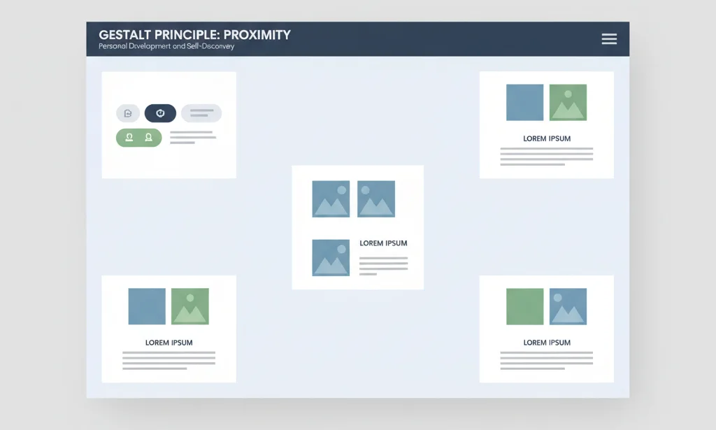
Proximity in web design refers to how close or far apart elements are placed on a webpage. When elements are placed near each other, users naturally assume they’re related. This idea comes from Gestalt psychology, which explains how humans group similar or nearby objects together in their minds.
For example, if a label is placed close to a text input field, users will assume they belong together. On the other hand, if there’s a large space between them, the connection might be lost.
In short, proximity helps users understand relationships between elements without reading every word.
Why Is Proximity Important in Web Design?
Proximity plays a major role in how users navigate, read, and interact with a website. Here’s why it matters:
- Improves Readability: Grouping related information makes content easier to understand at a glance.
- Enhances User Experience: Clear structure and layout reduce confusion and improve flow.
- Supports Visual Hierarchy: Proximity helps establish which elements belong together and which are separate.
- Guides User Behavior: It directs the user’s eyes and helps them focus on what matters most.
Proximity doesn’t just make your design pretty—it makes it functional and user-friendly.
How Proximity Works in Web Design
Proximity in web design is all about arranging elements thoughtfully. Here’s how it works in practice:
1. Group Related Elements
Place related items (like a heading and a paragraph, or a label and input field) close together. This helps users quickly understand their relationship.
2. Use White Space Wisely
Don’t just pack elements tightly. Whitespace is essential for separating unrelated items and improving visual clarity.
3. Create Visual Relationships
When things are grouped together visually, users assume a connection. This technique helps create structure and flow across your page.
4. Avoid Random Placement
Elements that are too far apart or inconsistently spaced confuse users. Consistency is key to maintaining user trust and clarity.
Also Check: Pinterest Advertising In 2025: Complete Guide
Common Areas Where Proximity Is Used
You’ve probably seen proximity at work in many places. Here are some common areas in web design where it’s especially important:
- Navigation Menus: Grouping links together under one section makes it easy to browse.
- Product Listings: Title, image, price, and “Buy Now” button are grouped so users know they belong to the same product.
- Forms and Fields: Labels, input fields, and error messages are placed together for ease of use.
- Headlines and Content: Headlines sit close to their respective content blocks.
- Call-to-Action Buttons: CTAs are placed near the offer or message they relate to.
Best Practices for Using Proximity in Web Design
To make the most of proximity, follow these practical tips:
- Maintain Consistent Spacing: Uniform gaps between related and unrelated elements help build clarity.
- Don’t Overcrowd: Leave room between elements so users don’t feel overwhelmed.
- Use Layout Grids: Design tools like flexbox and grid help maintain alignment and spacing.
- Combine with Other Principles: Use proximity along with contrast, alignment, and hierarchy for maximum impact.
- Test Across Devices: Make sure proximity works well on mobile, tablet, and desktop screens.
Tools and Techniques to Apply Proximity
Whether you’re a designer or developer, here are some practical tools and techniques to apply proximity effectively:
1. CSS Properties
- Use margin and padding to control spacing.
- Utilize flexbox and grid layouts for responsive grouping.
2. Design Tools
- Tools like Figma, Adobe XD, or Sketch allow pixel-perfect spacing.
- Use rulers and guides to ensure consistent proximity.
3. Wireframing and Prototyping
- Before jumping into development, map out your layout using wireframes.
- Prototyping helps test the proximity of elements and improve the user journey.
Proximity Mistakes to Avoid
Even though proximity seems easy, some common mistakes can hurt your design. Avoid these:
- Unrelated Items Placed Too Close: This confuses users and misleads their focus.
- Inconsistent Spacing: It makes the design feel messy and unstructured.
- Ignoring Mobile Responsiveness: Proximity needs to adapt across screen sizes.
- Lack of Visual Alignment: If grouped items aren’t aligned, users may miss the relationship.
Always review your design and test it with real users to spot these issues.
How Proximity Affects Conversion and Engagement
A well-structured website that uses proximity properly can increase engagement and conversions. Here’s how:
- Boosts Clarity: Users understand what to do faster—whether it’s filling out a form or making a purchase.
- Reduces Friction: Organized content means fewer clicks and easier decisions.
- Improves Trust: Clean, logical layouts feel more professional and reliable.
- Higher Click Rates: Well-placed CTAs with good proximity perform better.
For example, grouping an offer message, benefits, and a CTA button together often results in higher click-through rates than if those elements are scattered across the page.
Conclusion
Proximity is one of the simplest yet most powerful tools in your web design toolkit. By understanding how and where to use it, you can guide users effortlessly, improve engagement, and create a better user experience overall.
Whether you’re designing a new website or updating an old one, always ask yourself: Do these elements belong together? If yes, place them close. If not, give them space.
Great web design isn’t just about how things look—it’s about how they work. And proximity helps things work beautifully.
FAQ
1. What is the difference between proximity and padding?
Proximity refers to the visual closeness of elements to show relationships. Padding is a CSS property that adds space inside an element. Both can affect spacing but serve different purposes.
2. Can proximity be used in mobile-first design?
Yes! In fact, it’s even more important on smaller screens. Grouping and spacing must be optimized for clarity and ease of navigation.
3. How does proximity affect accessibility?
Proper proximity helps users with cognitive disabilities or screen readers by presenting content in logical, organized chunks that are easier to process.

Passionate about blogging and focused on elevating brand visibility through strategic SEO and digital marketing. Always tuned in to the latest trends, I’m dedicated to maximizing engagement and delivering measurable ROI in the dynamic world of digital marketing. Let’s connect and unlock new opportunities together!